Graphic identity
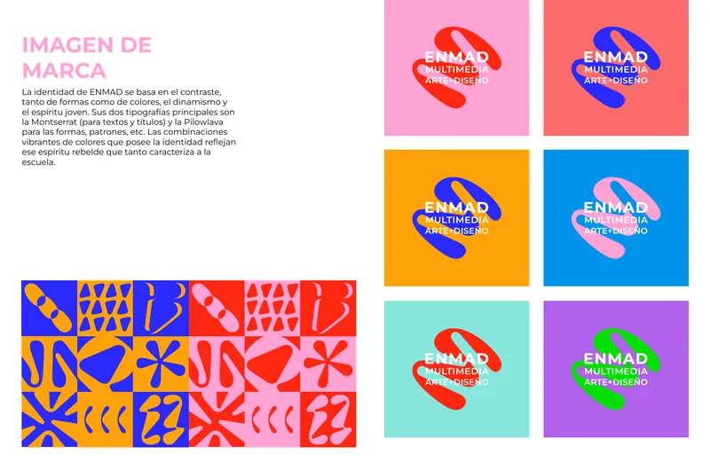
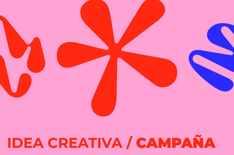
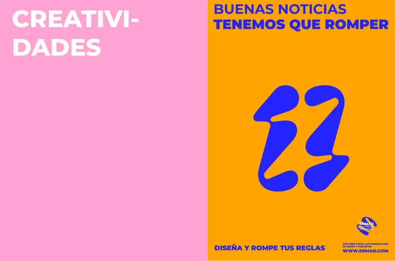
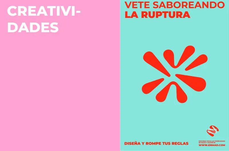
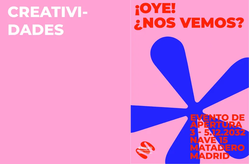
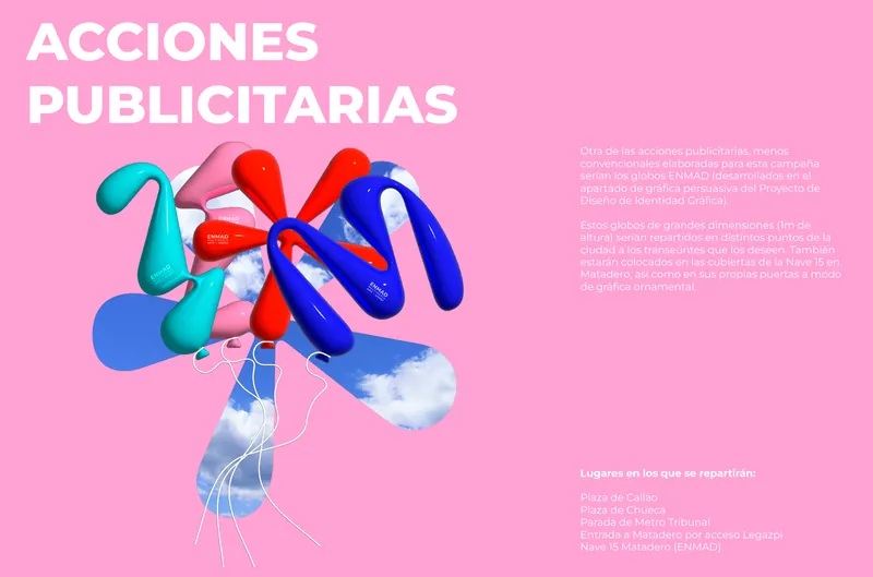
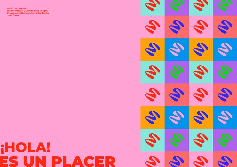
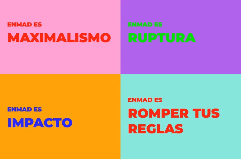
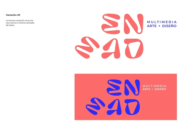
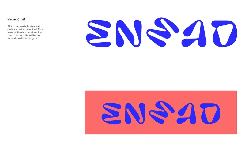
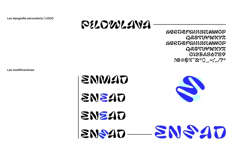
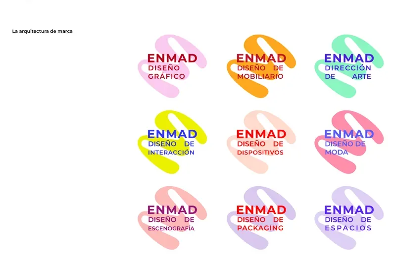
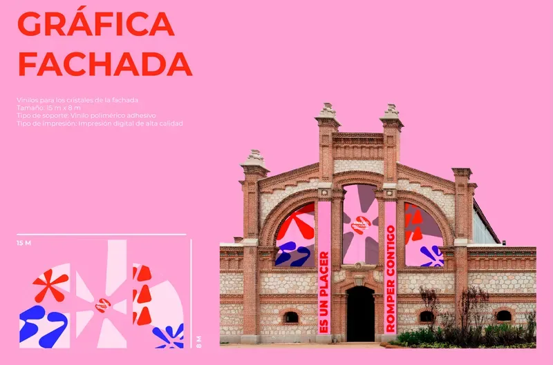
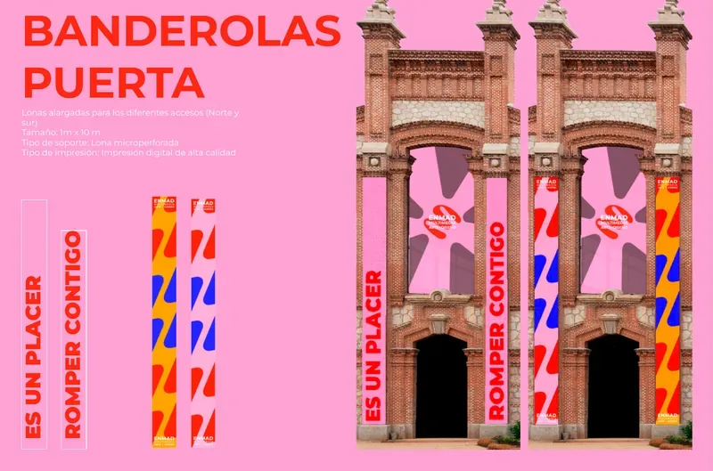
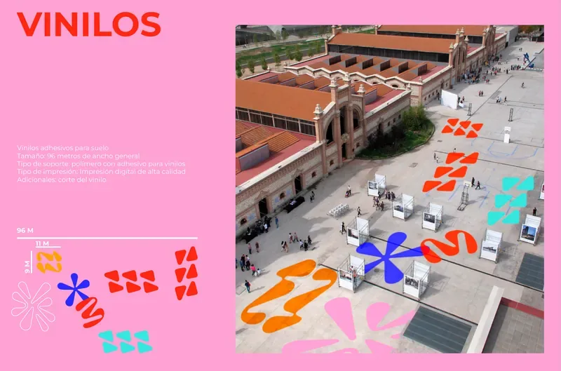
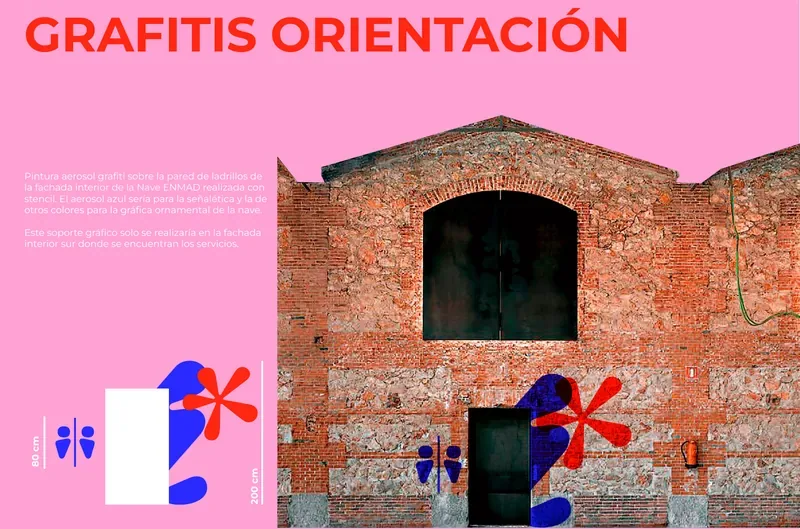
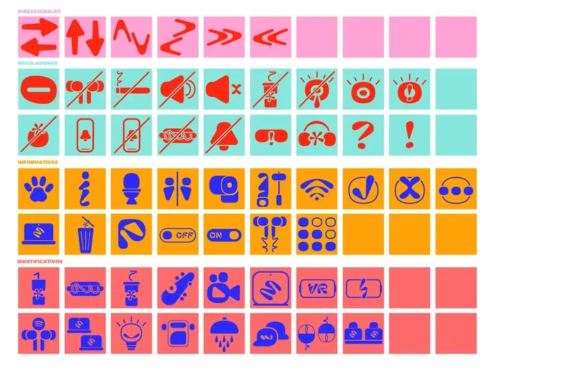
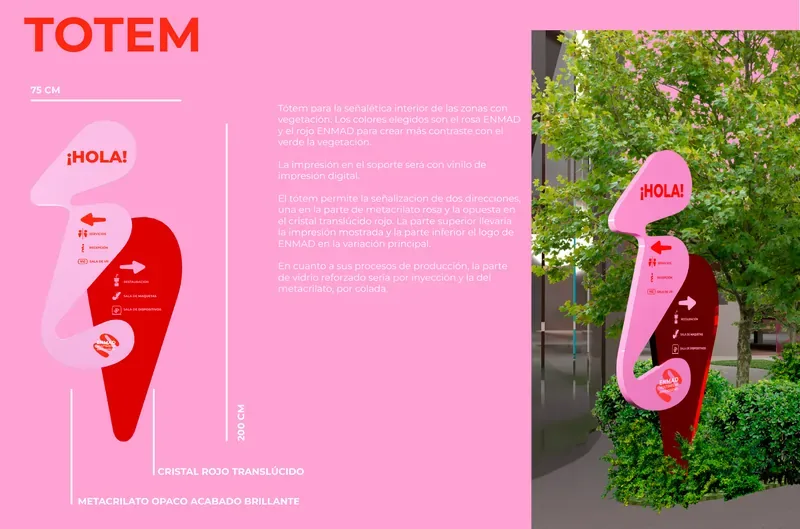
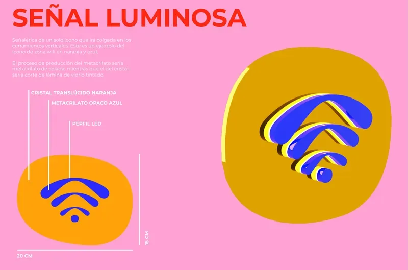
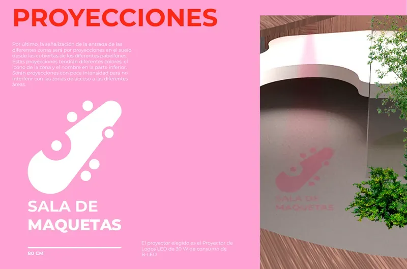
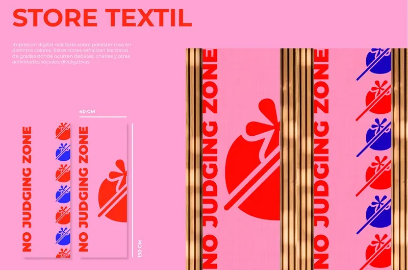
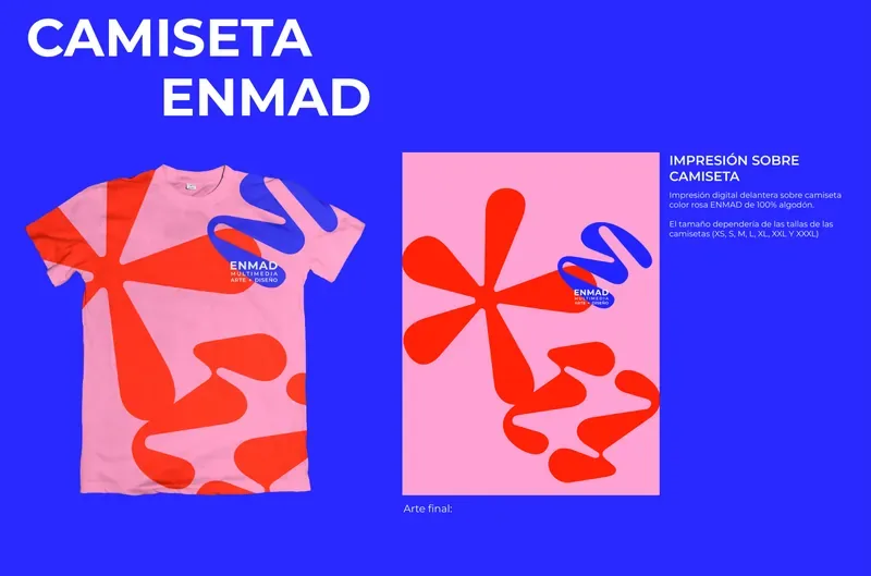
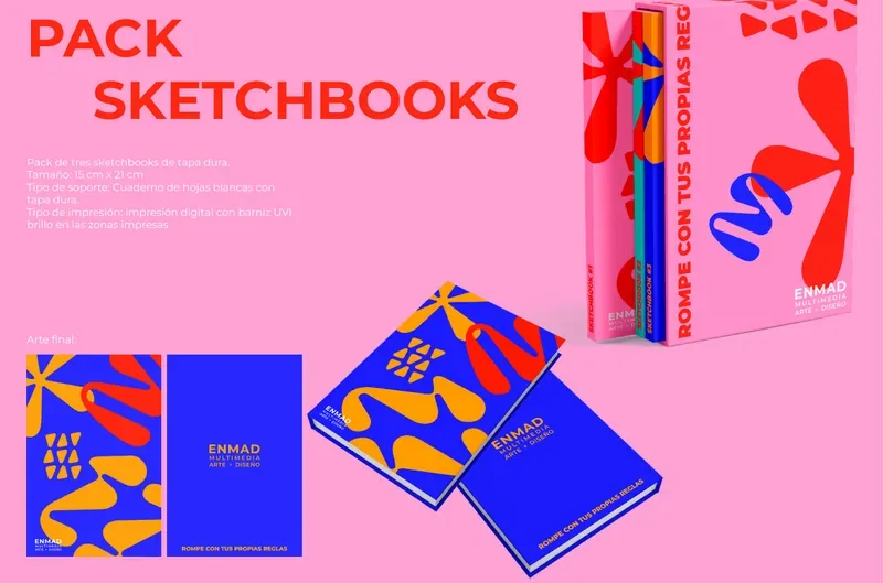
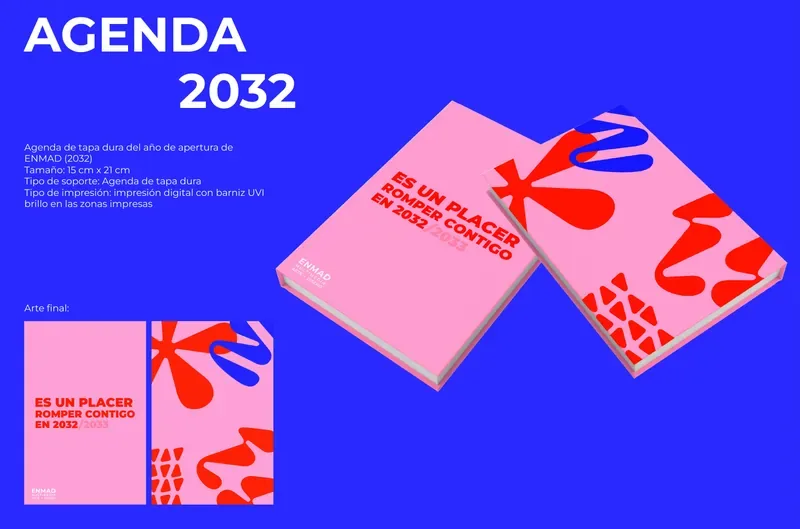
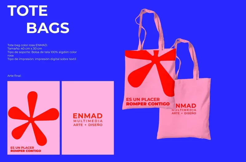
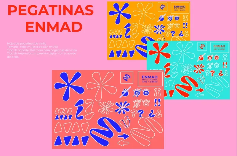
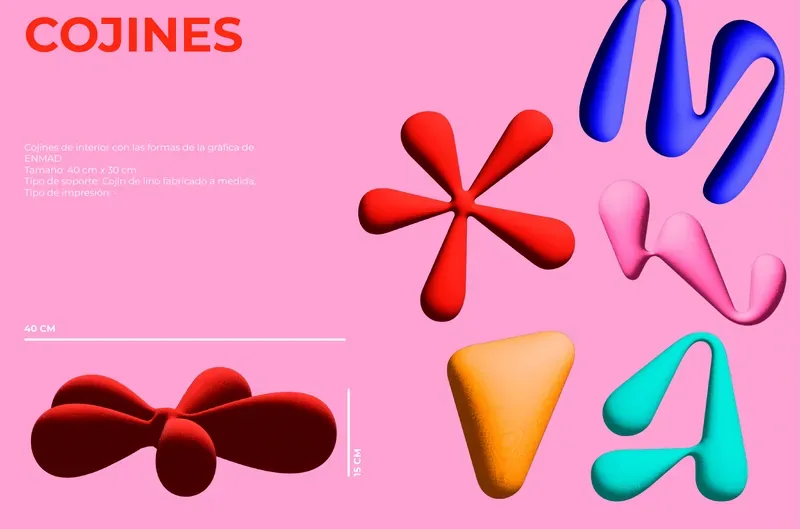
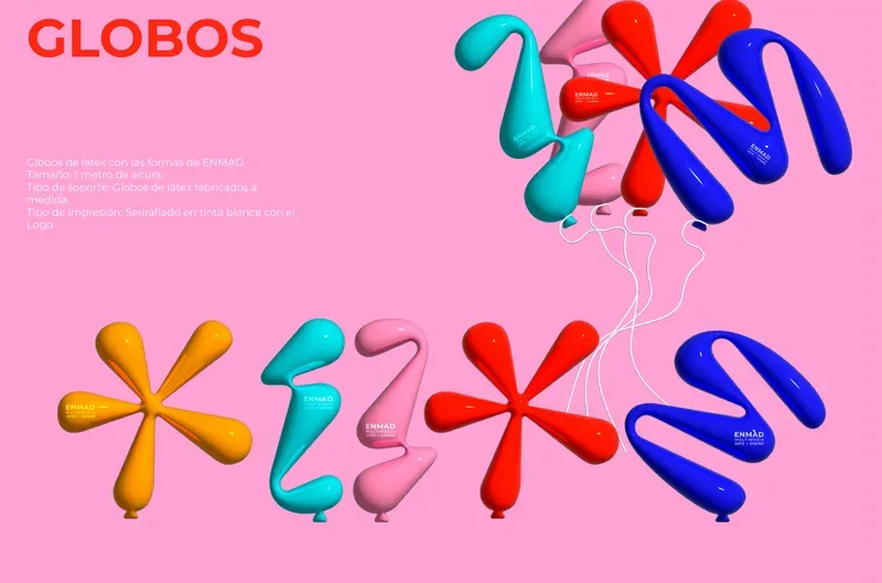
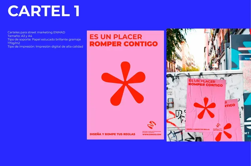
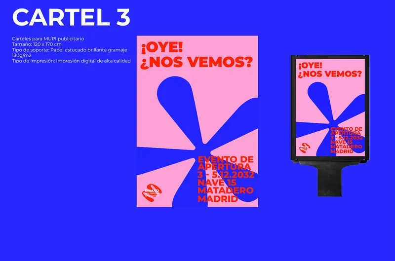
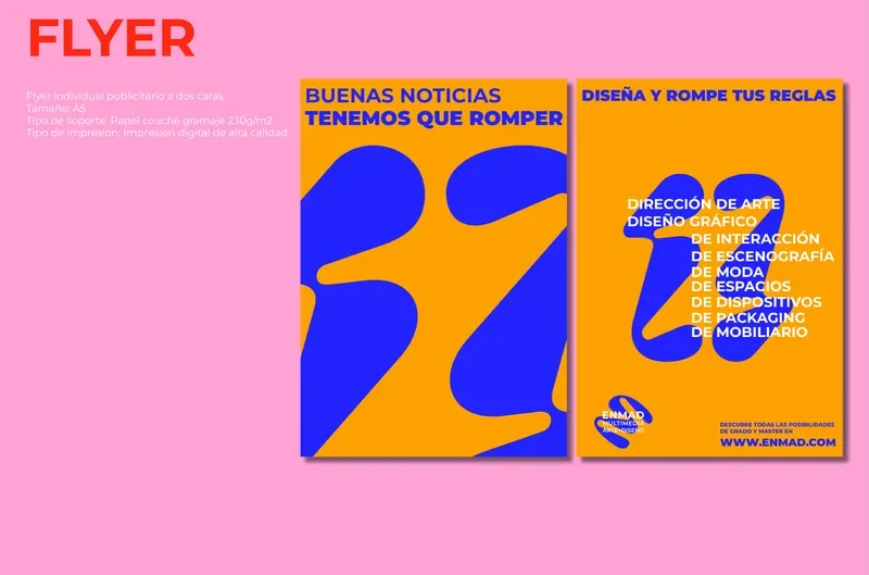
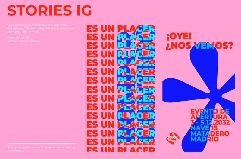
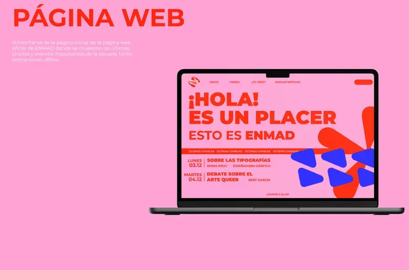
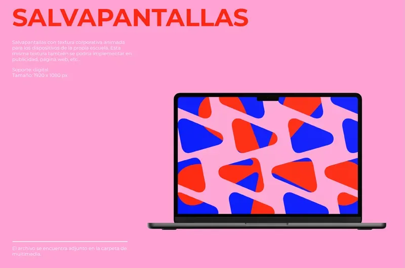
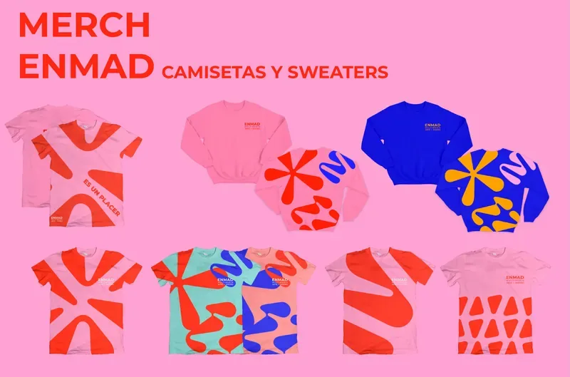
A maximalist identity made of shapes that look torn apart: a logo with three variations, a loud palette and a kit that covers the facade, banners, signage, merch, posters and the website.
Spatial design
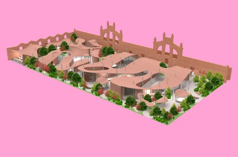
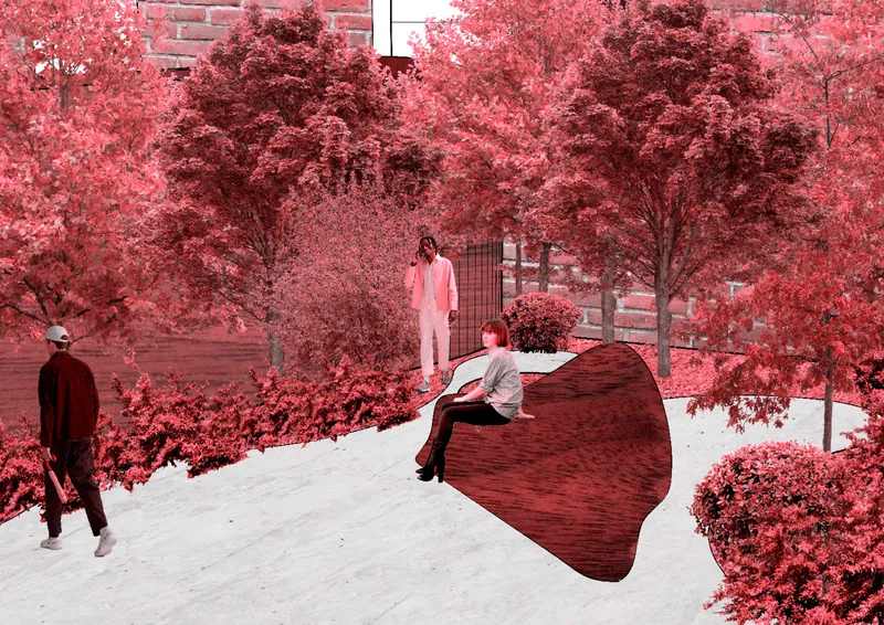
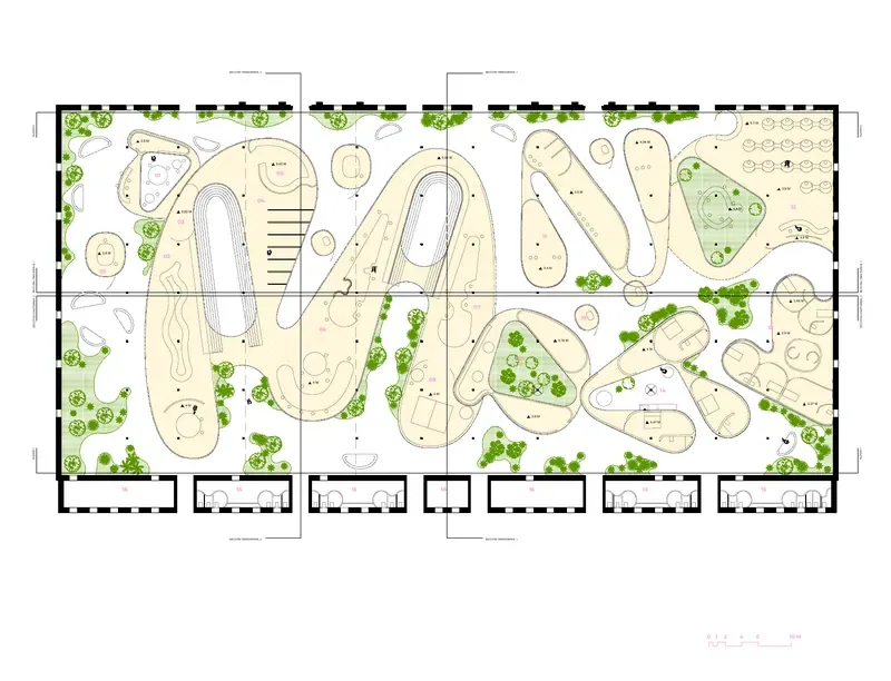
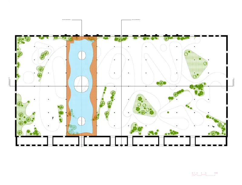
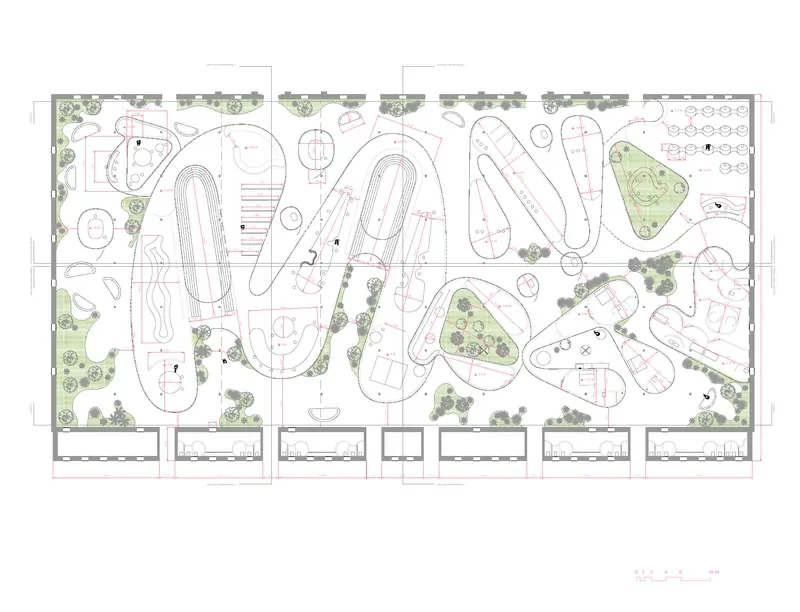
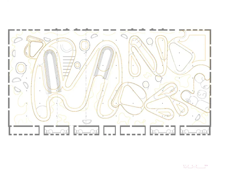
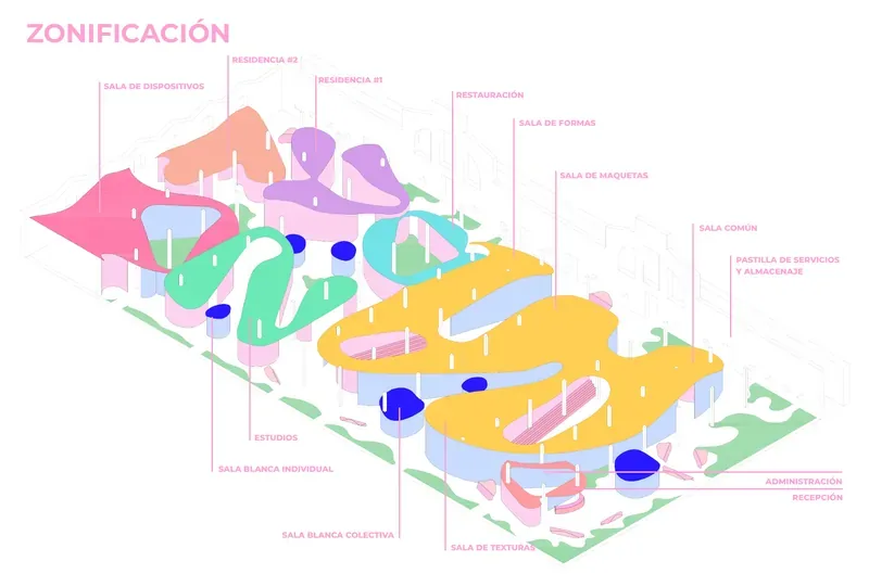
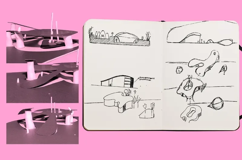
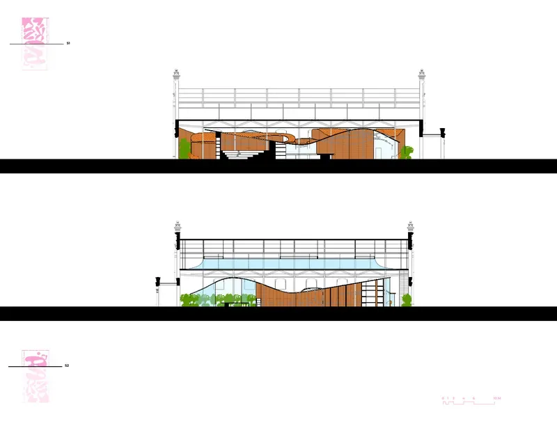
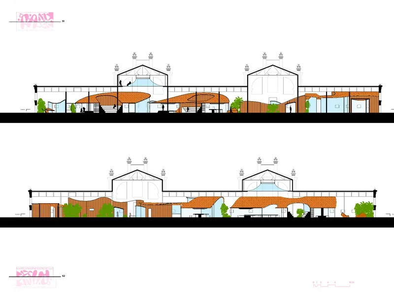
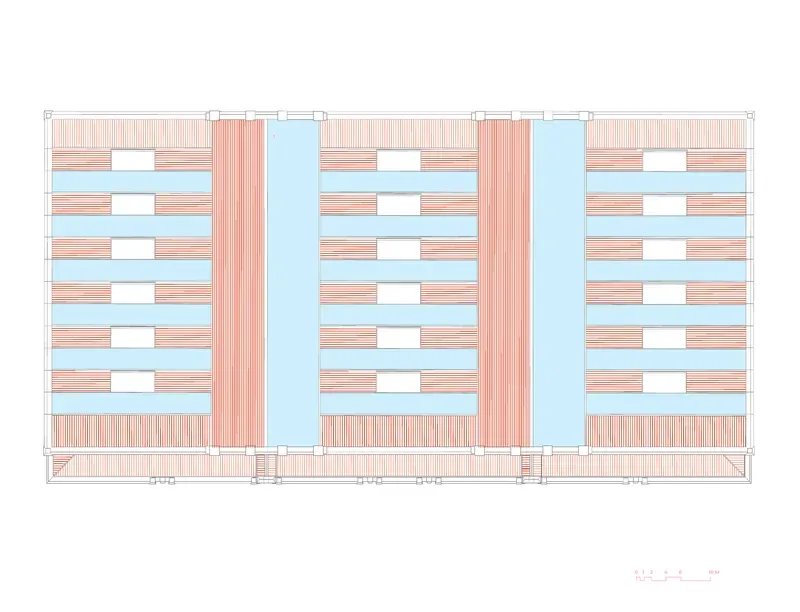
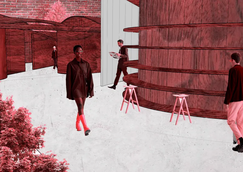
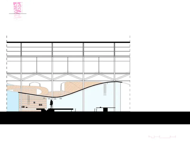
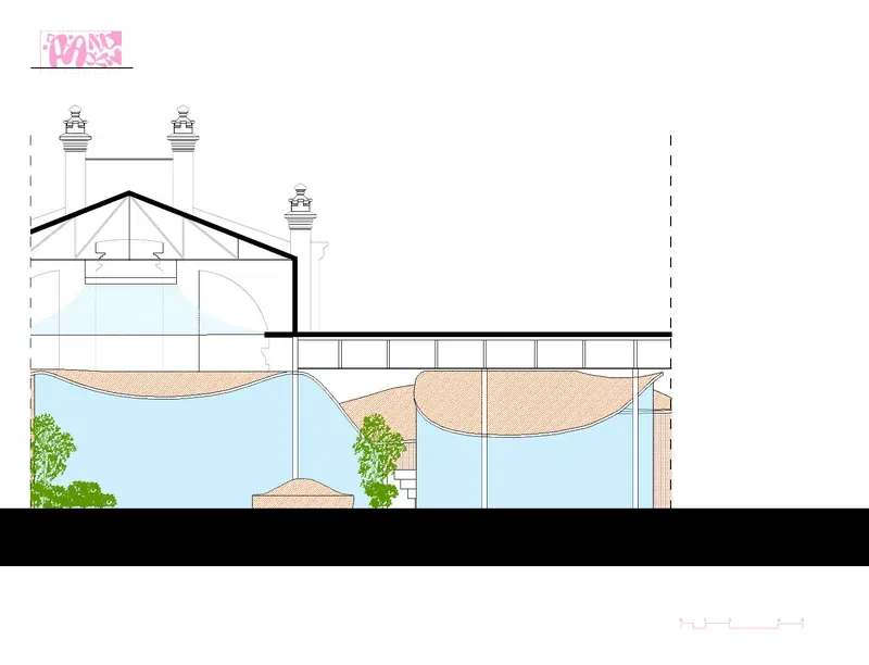
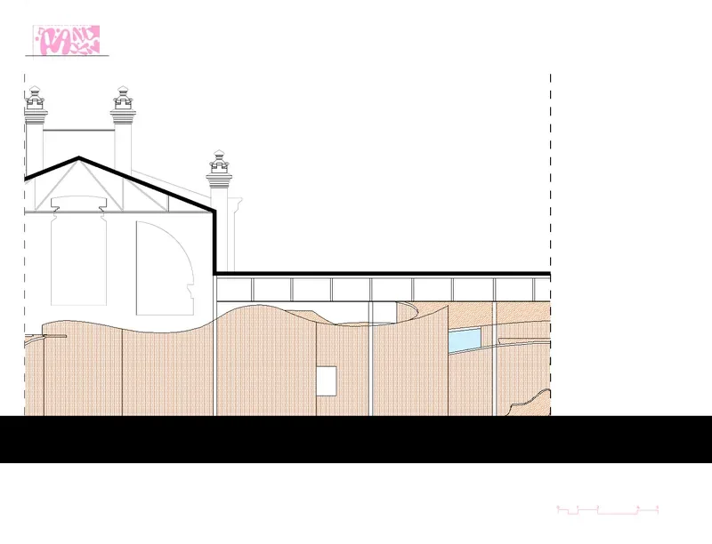
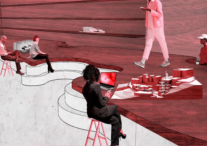
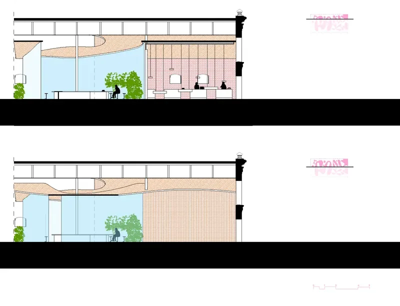
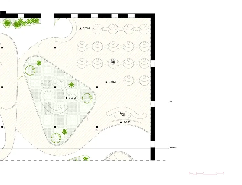
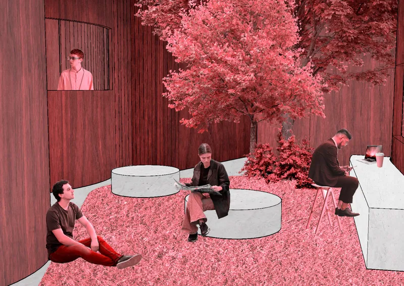
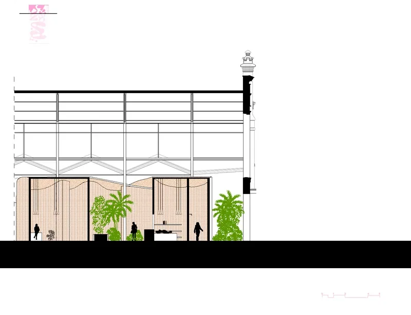
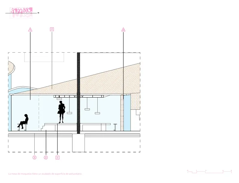
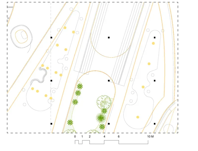
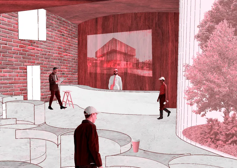
The shapes of the identity were laid on the floor plan of Nave 15 and then peeled off, like torn paper, to become curved roofs. Underneath them: studios, workshops, gardens, a canteen and rooms to stay, with no two spaces alike.
Brand management
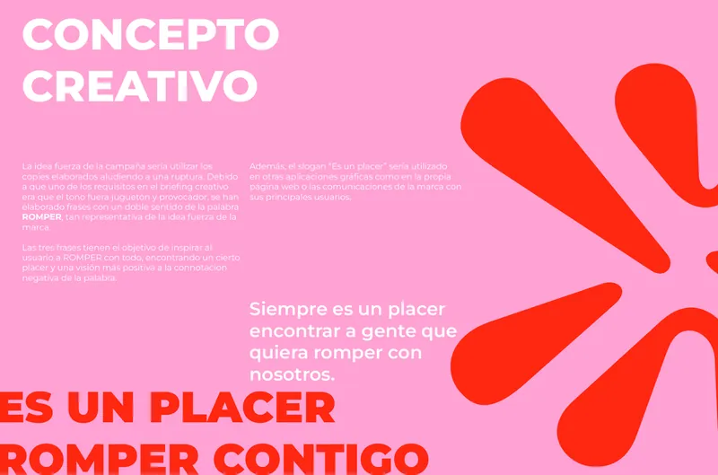
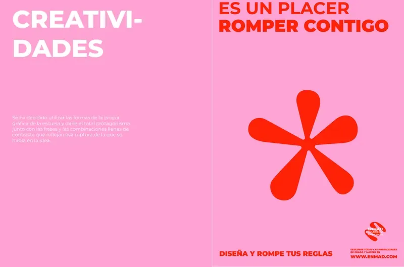
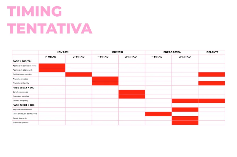
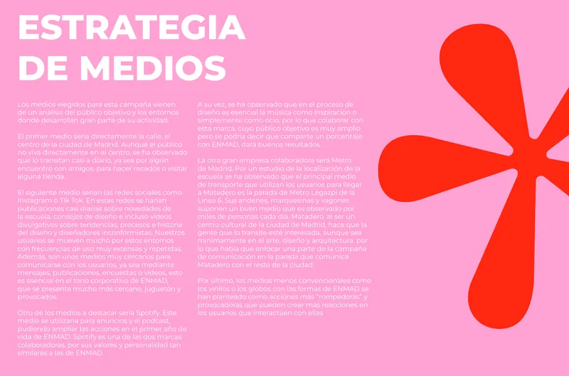
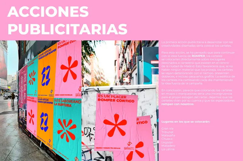
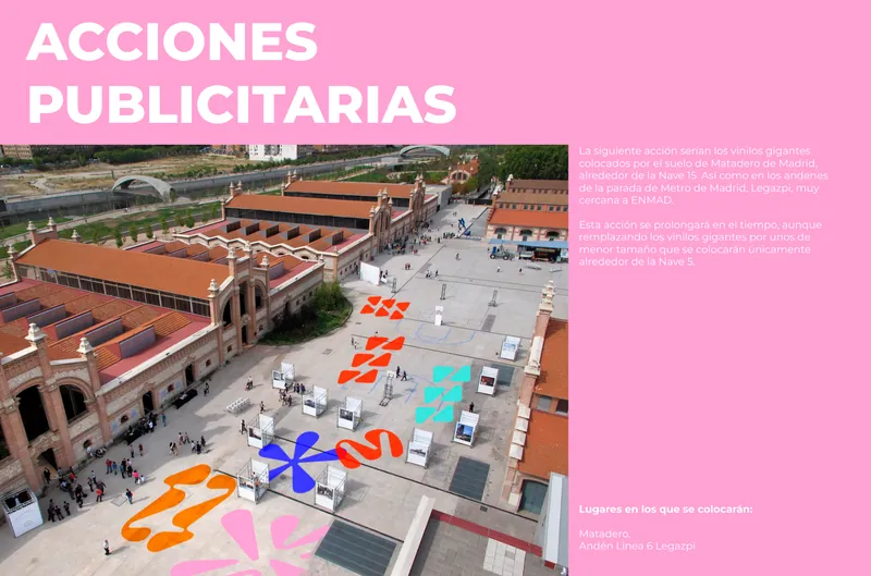
Mission, audience and the launch campaign: posters, social media, street actions around Matadero and an opening event, all under the same break-up line.